PROJECT OVERVIEW

SUPPLY THE LOVE
CONNECTING CLASSROOMS WITH LOCAL DONORS
Supply the Love is a non-profit company dedicated to providing a platform for classrooms to post supplies in need & connect them with generous community donors. This project was in conjunction with the web development class and UX immersive class through General Assembly
Target objectives
-
Classrooms can view available donation materials from local community and businesses
-
Classrooms can post supply needs
-
Community members and businesses can view classroom needs and donate directly
-
Community businesses can post donations being offered
-
Ability to coordinate delivery and pickup
Team: 3 Designers, 3 Web Developers
My Role: User research, customer journey mapping, information architecture, user flows, wireframing, testing.
Tools: Slack, Pen and Paper, Google Drive, Excel, Typeform, Sketch, Invision App, Adobe Illustrator, lots of Post-it notes
Timeline: 2-weeks

RESEARCH & DISCOVERY
Typeform Survey
UX Research is essential. We started our research and discovery process by putting together a survey for both teachers and donors with questions that targeted our initial assumptions but also allowed them to tell us their pain points and experience with receiving and providing donations. Around 30 reachers responded and 5-6 donors. This was enough to tell us the following:
Survey Insights: Teachers
-
73% of classrooms are in need of supplies
-
50% preferred cash
-
Volunteers often needed
-
Majority need donations anytime of year
-
73% of donations go to teachers, 38% to PTA
-
Budgets from administration don’t last
-
More technology needed
-
Half of donations from parents, other half from PTA
-
Only 4% from local businesses
Survey Insights: Donors
-
Finance Dept. keeps track of items that could be donated to classrooms
-
Willing to donate if they received a tax write-off
-
Want to know the impact donation will have on the classroom
-
Recognition for generosity
Competitive Analysis
We researched competitive sites and reviewed them for their strengths and weaknesses. We used this information to determine what features we could include into our product and discover voids that are currently not being fulfilled in the market.

USER GOALS & OBJECTIVES
Customer Journey Map
I order to create a better understanding of our users, their pain points, and emotions, we collaborated to create a Journey Experience Map. This strategic map helped us visually capture and communicate the user’s process and their needs, perceptions, and interactions. This led us to discover a few additional ideas to include, such as a notification affirming the donation and how the communication works after a donation is made.

User Personas
Developing persona’s help us tell the story from the users perspective, developing empathy while keeping a users needs in mind.

IDEATION
Affinity Mapping
We created various iterations of affinity maps to help us understand the following:
-
Understanding the Mental Models of Users
-
Taxonomy
-
Start to define Onboarding process
-
Identifying crucial and MVP user flows
-
Defining the Information Architecture

Permission Levels
Although the content will vary depending on the user, we determined it was possible to have similar profile pages for donors and classrooms. This made the job for developers easier and provided a consistent look across multiple pages. The viewable information would vary based on permission levels .

The chart helped define what information is shown based on the user.
Taxonomy Brainstorming
Below are some of my notes that further explored what information is needed and where.

WIREFRAMING
Concept Sketching
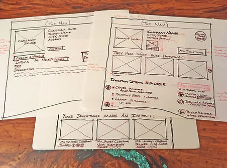
In order to quickly develop wireframe ideas, we hand sketched various layouts before moving into Sketch to develop them further.

A few of my sketches for the profile pages
Wireframe Iterations
Using the bootstrap framework so that our site could be fully responsive, I started designing our wireframes on a desktop layout to make sure we had all the information we wanted to show on the profile pages

Donor profile page wireframe
Mobile design
To aid in the communication with the Web Development team, we laid out several pages on mobile so the fully understood how it responses to mobile.

Searching for a classroom and making a donation
INTERACTIVE MOCKUP & TESTING
One of the designers developed a high fidelity version of the wireframes that we added to Invsion as a working prototype
We tested the interactive mockup on a handful of users and demonstrated the mockup to the web development team. We provided them with annotative notes to assist their efforts in building the working prototype.